A facade in modern classical style
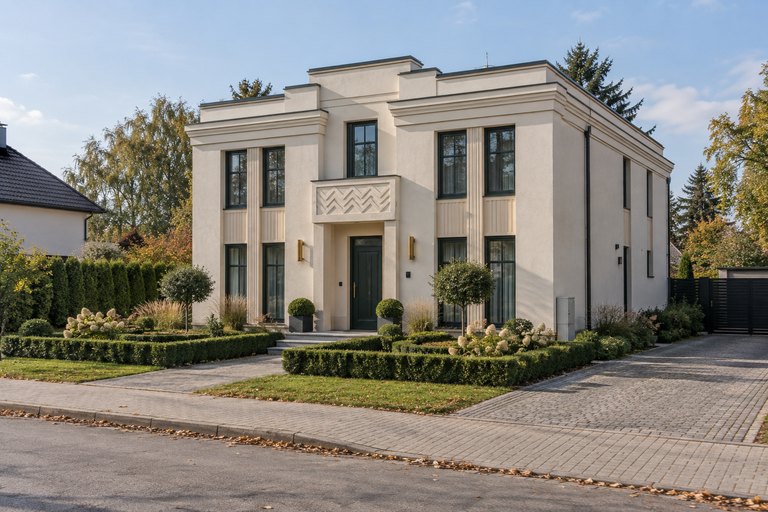
Classical proportions in muted grey — elegance without ornament.
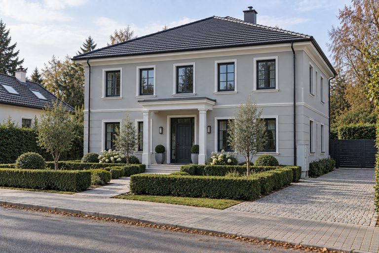
Modern classicism is the compromise many owners are looking for: it keeps the symmetry, the regular window layout and the feel for proportion known from classicism, but trades the rich detail for calm planes of pale grey and white.
The detail does not disappear entirely — a delicate cornice remains, a subtle band around the windows, sometimes light rustication on the ground floor. The difference is scale: everything is shallower, thinner and more muted than in traditional classicism. The joinery is usually anthracite, less often white.
It is a very safe choice for houses with symmetrical massing, especially where you want elegance without the house looking old-fashioned. Because the result turns on nuances in the shade of grey, a visualisation on your own photo saves a lot of hesitating over colour cards.
Which houses it suits
- Houses with symmetrical massing and a regular window layout
- Buildings that want elegance without historicism
- Owners looking for a safe, timeless choice
Colours and materials
- Light and mid greys
- White cornices and window bands
- Anthracite joinery
Common questions
How does it differ from the classical style?
In palette and in the scale of the detail. Classical rests on warm beiges and pronounced profiles; modern classicism uses cool greys and far subtler detail.
Will a grey facade look gloomy?
The shade and the contrast decide. A light grey with white bands reads as airy; the problem only appears with dark, uniform greys and no lighter accents.
Similar styles